Why B2B Websites Fail Before the First Sales Call


A polished website can still be commercially weak
Many website projects are judged by appearance, launch date, and stakeholder approval. Those standards matter, but they do not answer the commercial question. Can the site help a qualified buyer make the next decision before speaking with sales. A site can look modern, use strong photography, and contain accurate service descriptions while still forcing the buyer to do too much interpretive work.
The failure usually begins with company first architecture. The site explains who the company is, how long it has operated, what services it offers, and why the team cares. The buyer is left to determine whether the company understands the problem, whether the solution fits the situation, whether the outcome is credible, and what should happen next. In complex B2B decisions, that ambiguity is friction.
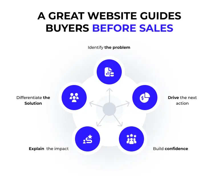
The website has a job before sales enters the conversation
Before a sales call, the website should create five forms of clarity. The buyer should recognize the problem. The buyer should understand the business consequences. The buyer should see how the company approaches the problem differently. The buyer should find evidence that reduces risk. The buyer should know the next action and what that action requires.
This does not mean the site must close the entire sale. Most B2B purchases involve multiple people, internal discussion, and further validation. The site should make the first decision easier. That decision may be to complete an assessment, review a case study, compare a service path, share an article with a colleague, or apply for a focused conversation. A site that cannot guide that movement is functioning as a digital brochure rather than a commercial system.
Company language creates buyer work
Generic statements such as innovative solutions, trusted partner, end to end service, and customized approach create little decision value because they do not define the tension the buyer is trying to resolve. The more a site relies on broad claims, the more the buyer must translate those claims into their own operating context.
Strong page language starts with the buyer problem, the cost of leaving it unresolved, and the decision the page is designed to support. It uses plain language without making the work sound small. It states the outcome, shows the operating logic, and makes proof visible. This is especially important for advisory and service businesses where the product is partly intangible until the engagement begins.
Weak proof stops the journey even when the message is clear
A clear promise creates interest. Proof creates permission to continue. Buyers need evidence that the company has solved a relevant problem, understands the operating environment, and can manage the risk of implementation. Proof may include case studies, quantified results, before and after conditions, named expertise, process transparency, client language, or representative deliverables.
Proof should appear near the claim it supports. A service page that promises faster growth should not force the buyer to search a separate testimonial page for evidence. A claim about AI governance should show the controls, roles, validation, and measurement used in the workflow. A claim about website conversion should show the decision path and the asset system. Proof architecture is a page design decision, not a footer decoration.
Too many calls to action create no clear call to action
B2B websites often present several equal choices because every internal team wants visibility. Contact us, learn more, schedule a demo, download a guide, subscribe, view services, and meet the team may all appear on the same page. The visitor is given options but no guidance. When the next step requires interpretation, many users choose not to act.
Each page should have one primary conversion job. A high intent service page may route to Apply. A diagnostic article may route to a scorecard. An AI education page may route to an assessment. A case study may route to the relevant service path. Secondary actions can exist, but the hierarchy must be obvious. The site should route the buyer based on readiness rather than treating every visitor as ready for the same conversation.
Performance and accessibility are commercial requirements
Conversion is influenced by whether the page loads, responds, and remains stable enough for the user to engage. Google defines Core Web Vitals around loading performance, interactivity, and visual stability. The current good thresholds are an LCP of 2.5 seconds or less, an INP of 200 milliseconds or less, and a CLS of 0.1 or less at the seventy-fifth percentile. Those measures do not replace content quality, but poor performance can prevent the buyer from experiencing the content at all.
Accessibility is equally practical. Headings, focus states, contrast, captions, transcripts, alt text, keyboard use, and readable mobile layouts affect real people trying to evaluate the business. Complex animations and visual frameworks should have meaningful static fallbacks. The strongest site does not force the buyer to choose between a premium experience and a usable one.
The website must connect to sales ownership and measurement
A website conversion is not complete when a form submits. The request must enter a defined sales path with source context, service interest, urgency, desired outcome, and an accountable response owner. If the buyer receives a generic reply, waits too long, or has to repeat everything already submitted, the website has handed demand into friction.
Measurement should connect page behavior to qualified outcomes. Track service CTA clicks, assessment starts and completions, Apply starts and submissions, case study views, video engagement, sales acceptance, stage movement, and influenced pipeline. Pageviews alone cannot tell leadership whether the site is helping buyers decide. The website becomes commercially useful when its role can be seen in the revenue system.
A B2B website should reduce the cost of understanding and choosing
The best website does not say everything. It organizes the right information in the order the buyer needs it. The home page defines the system and routes the path. Service pages explain. Case studies prove. Assessments qualify. Insights educate. Apply converts. Contact handles the inquiries that do not belong in the commercial path.
That architecture reduces the cost of understanding the company and the risk of choosing it. It also improves sales quality because prospects arrive with stronger context and more specific questions. The website has done work before the first call. That is the standard a redesign should be held to.
- Define the page level buyer question before writing copy or selecting visuals.
- Show the problem, consequence, approach, proof, risk reduction, and next decision.
- Use one primary CTA and route different readiness levels intentionally.
- Connect from context to CRM ownership, response standards, and follow up.
- Measure qualified progression, not only visits, clicks, and time on page.
- Protect performance, accessibility, and mobile usability during design decisions.
The website must support the whole buying group
A serious B2B site must work for more than the visible champion. Finance may need investment logic. Operations may need implementation sequence. IT may need data and governance clarity. An executive may need strategic fit and proof of leadership accountability. If those stakeholders cannot find enough evidence, the champion carries the burden of translating the offer internally.
Website architecture should therefore include portable proof, clear service boundaries, implementation answers, and direct paths for different levels of readiness. The objective is not to create separate sites for every role. It is to make the central market story strong enough that each stakeholder can locate the evidence required for the shared decision.
The site should route different levels of readiness
Not every qualified visitor is ready to apply. Some know the business has friction but cannot name the constraint. Some are comparing a specific service. Some need proof before involving other leaders. Some have a time bound problem and want a direct conversation. The site should provide a low friction diagnostic, service education, proof, and a high intent apply path without forcing every visitor into the same form.
This routing also improves lead quality. The information a visitor consumes and the path selected create useful context for follow up. The website becomes part of qualification and onboarding instead of a digital brochure that hands an anonymous form submission to sales.
Frequently asked questions
Why do B2B websites fail to generate qualified leads?
They often describe the company and services without helping the buyer diagnose the problem, evaluate proof, reduce risk, and choose a clear next step.
What should a B2B website do before a sales call?
It should create problem clarity, relevance, proof, risk reduction, and a guided action that matches the buyer’s readiness.
How should a website connect to sales?
Forms and assessments should pass source context, service interest, urgency, and desired outcome into a defined CRM stage with an owner and response standard.
What should leadership measure after a redesign?
Measure qualified CTA progression, assessment completion, Apply submissions, sales acceptance, stage movement, influenced pipeline, Core Web Vitals, and accessibility performance.
Sources & Further Reading
Make Your Website Work Before the Sales Call
Forward Thinkers can help turn your website into a clearer buyer journey that builds relevance, proof, and confidence before sales enters the conversation. Explore Digital Transformation.